Summary
The Xtremepush’s platform needed a better interface to improve user experience. Colours and interactions had been overlooked and the team didn’t have the resources for a radical redesign.
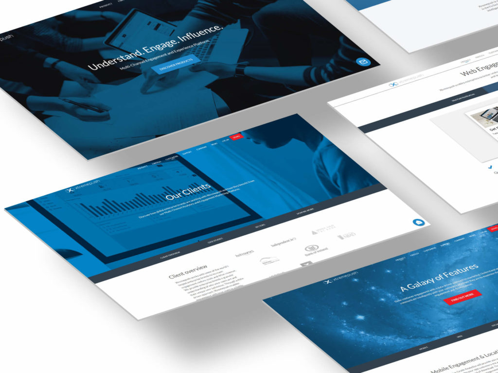
At Xtremepush I covered the role of main UI and UX designer, helping the company grow from their very beginning to the reach of global success.
A new UI
In the early stages of the company, their CRM needed a UI refresh and a restructure of some user interactions.
The overuse of grey shades made all UI elements look disabled or inactive. There was little colour contrast and no accent colour to guide the user focus through their journey.
The result was a dull look and an inaccessible interface.
The project started with a competitor analysis, researching popular colour palettes and considering the psychology behind the use of colours. We also collected feedback from users about their perception of the UI. For this last point, I collaborated with the sales team that was in direct contact with our main users.
Limitations
The project started with a competitor analysis, researching popular colour palettes and considering the psychology behind the use of colours. We also collected feedback from users about their perception of the UI. For this last point, I collaborated with the sales team that was in direct contact with our main users.
Due to the limited resources, the development team could not dedicate lots of time to the redesign. Also, I was asked to not re-design the core of the UI to limit the impact on the production cycle.
I’ve then agreed with the CTO to improve the colour palette and how colours were used. We also agreed to correct some other UI issues to improve the overall user experience.
The changes were then planned to give the product a fresher look, acting mainly on the CSS rules rather than the HTML structure.
Discovering Biases
Interviewing the internal experts and crossing the data with the user feedback, a big bias emerged. The team had designed and coded only on Apple devices and this influenced the construction of the first UI.
As turned out, the majority of clients’ computers were Windows machines with really bright, 72dpi, cheap displays.
If on MacBook screens the colour contrast was barely acceptable, on average office monitors it was a real issue.
Simple solutions like a proper use of colours and contrasts, adding hover effects on table rows, consistent buttons styles, and a good use of drop shadows greatly improved the overall experience on every screen.
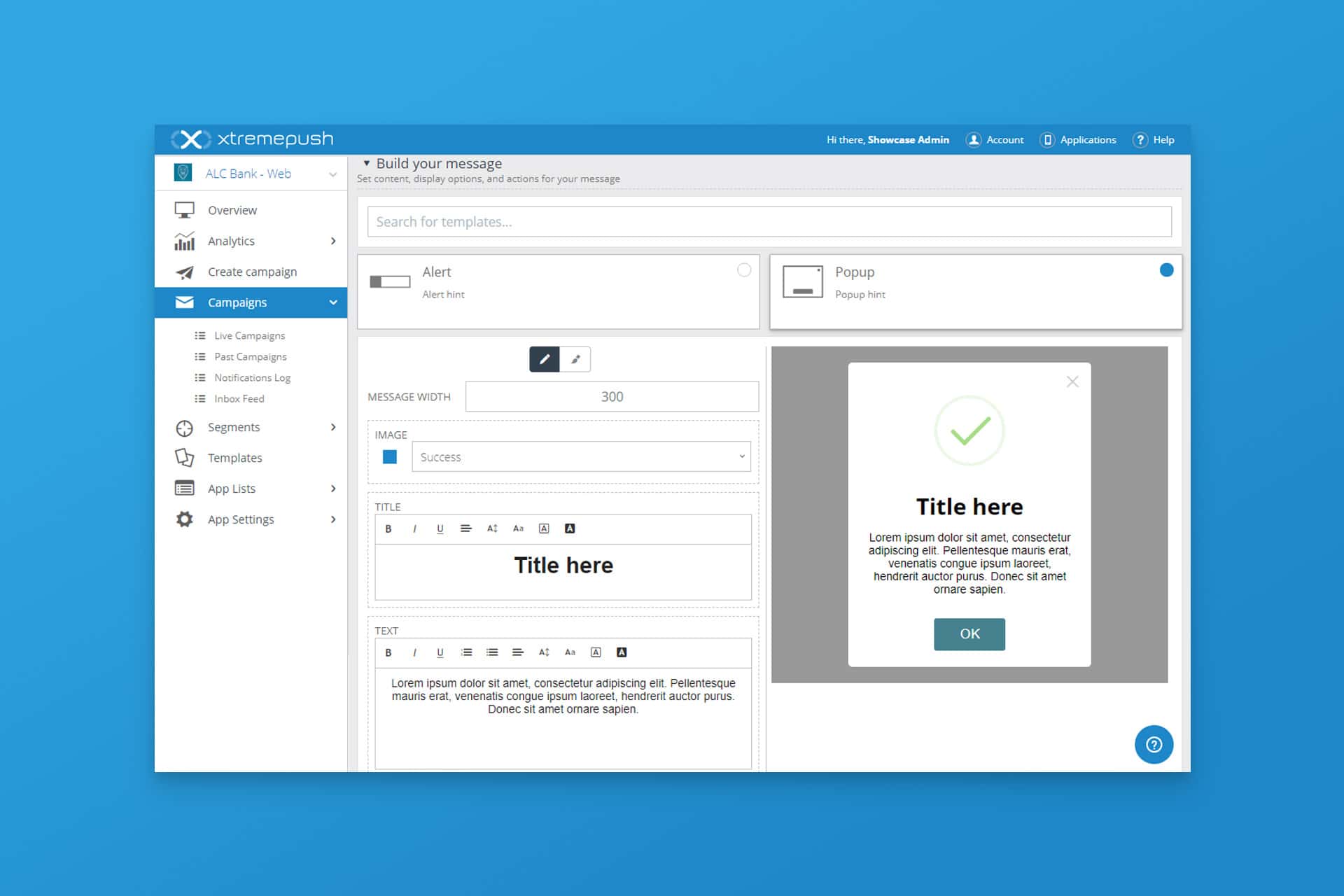
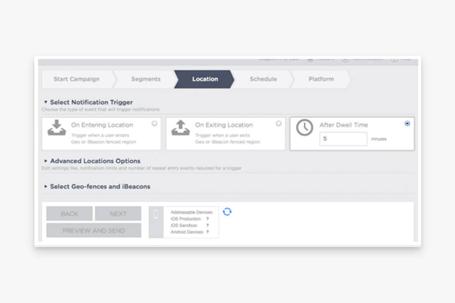
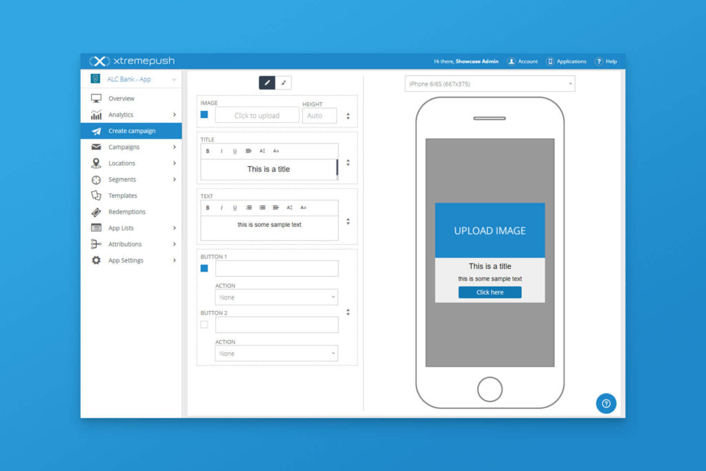
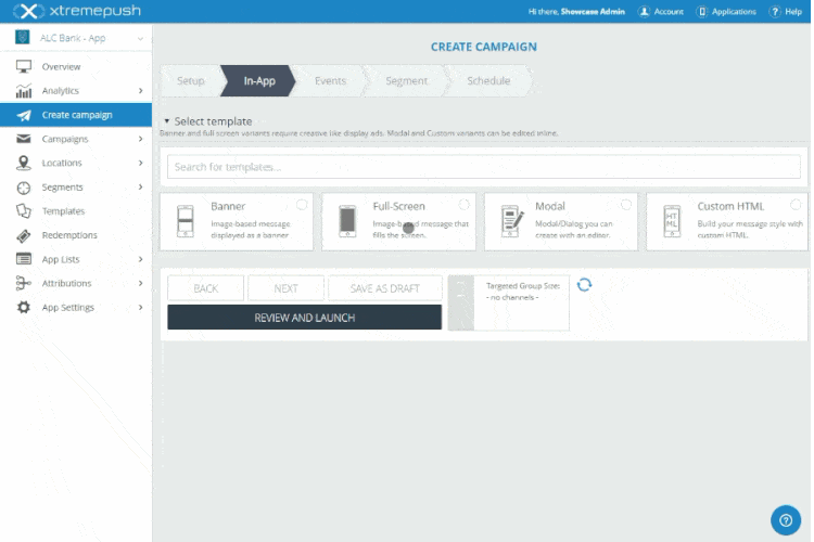
An editor for “In-App messages”
A special case in this project was the In-app messages editor, one of the most used sections of the platform. It allows users to set up a popup-like message that appears in the connected application.
An essential part of this project was to build a multi-functional editor that should have been easy and quick to use.
Through the use of progressive disclosure, the user flow has less friction as the UI adapts to the user choices reducing cognitive load and keeping the user focus on their intended task flow.
Through the use of progressive disclosure, the user flow has less friction as the UI adapts to the user choices reducing cognitive load and keeping the user focus on their intended task flow.
The value of this project
Constantly communicating with other departments I’ve been able to understand and meet both user and business needs.
Managing requirements and constraints while applying UX principles, I’ve designed a solution that improved usability and remained in adoption in the product for years.

Other projects I followed for Xtremepush