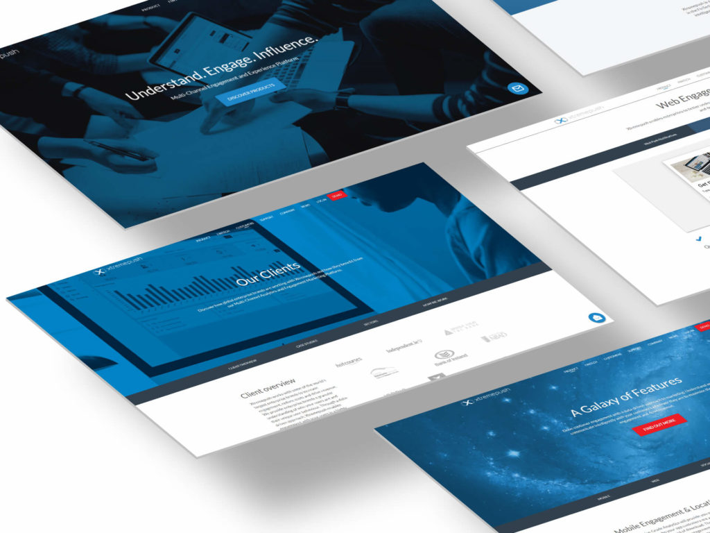
The need for something custom
Being Xtremepush in a very specific market, a standard icon font was not enough to cover the specific needs of the company.
Internet standard icons like menu hamburger, search magnifier, download could fit their use cases, but the real problem was to find icons that were representing the unique products of the company.
For this reason, we found necessary to have a custom font that could be used on both the website and the SaaS dashboard (main product).
Style Choices
Every font has a unique charm and that impacts and also help to define the image of whom is using it.
The choice was then a not-too-thin, line-icon style as the company wanted to look technical, modern, serious, and ‘sharp’.
The most influencing reference taken for these icons has been the Windows 10 icons pack.
Making the icons
Once the style guidelines were clear, I started to audit all the icons needed and I prepared a grid sheet with square cells.
Sketching multiple ideas for the same icon in this grid has made easy to present my work for feedback.
Once the sketches have been approved, the next step was to recreate them in Illustrator.
The icons were built on a 32px base, with 2px line thickness.
Other project I followed for Xtremepush