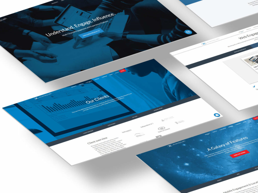
Summary
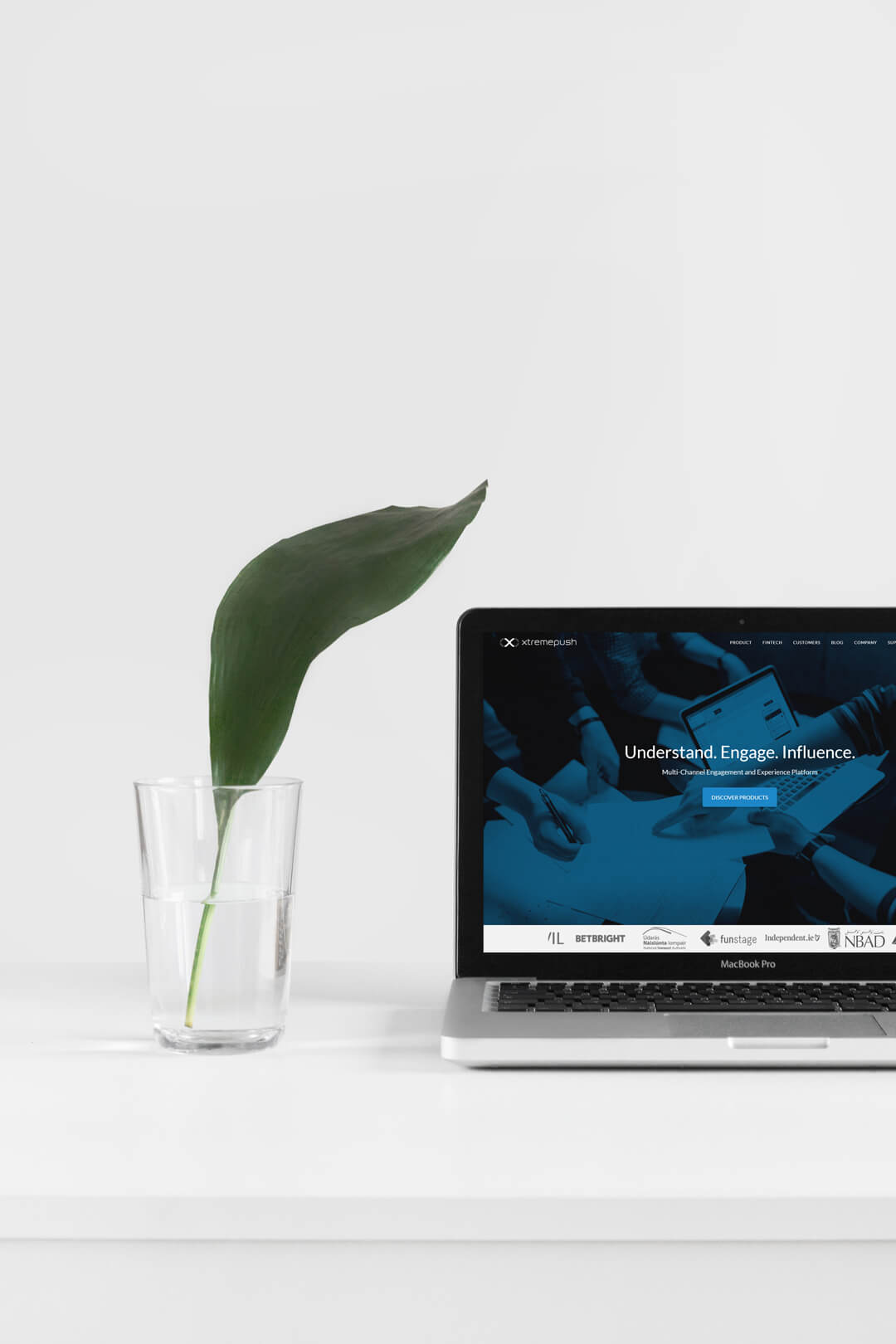
Xtremepush was in its second year of life and needed a professional website to jump in the market.
At Xtremepush I covered the role of main UI and UX designer, helping the company grow from their very beginning to the reach of global success. For this project I was tasked with the design of the first corporate website of the company. This project was included in the general rebranding that the company was crossing.
In 2013 marketers were starting to understand the importance of custom content in marketing campaigns and the benefits of personalised marketing as opposed to the old-fashioned “Spray n pray”.
In the same period, a new company was born and joined the revolution that made the user experience every year more central to marketing campaigns.
I had the luck to join the Xtremepush team in April 2015 and drive the company visual transformation and UX improvement since the early stages.
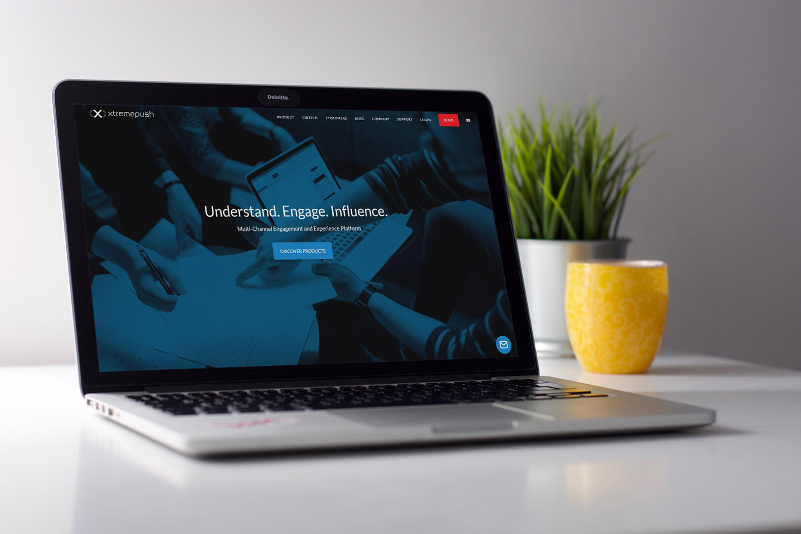
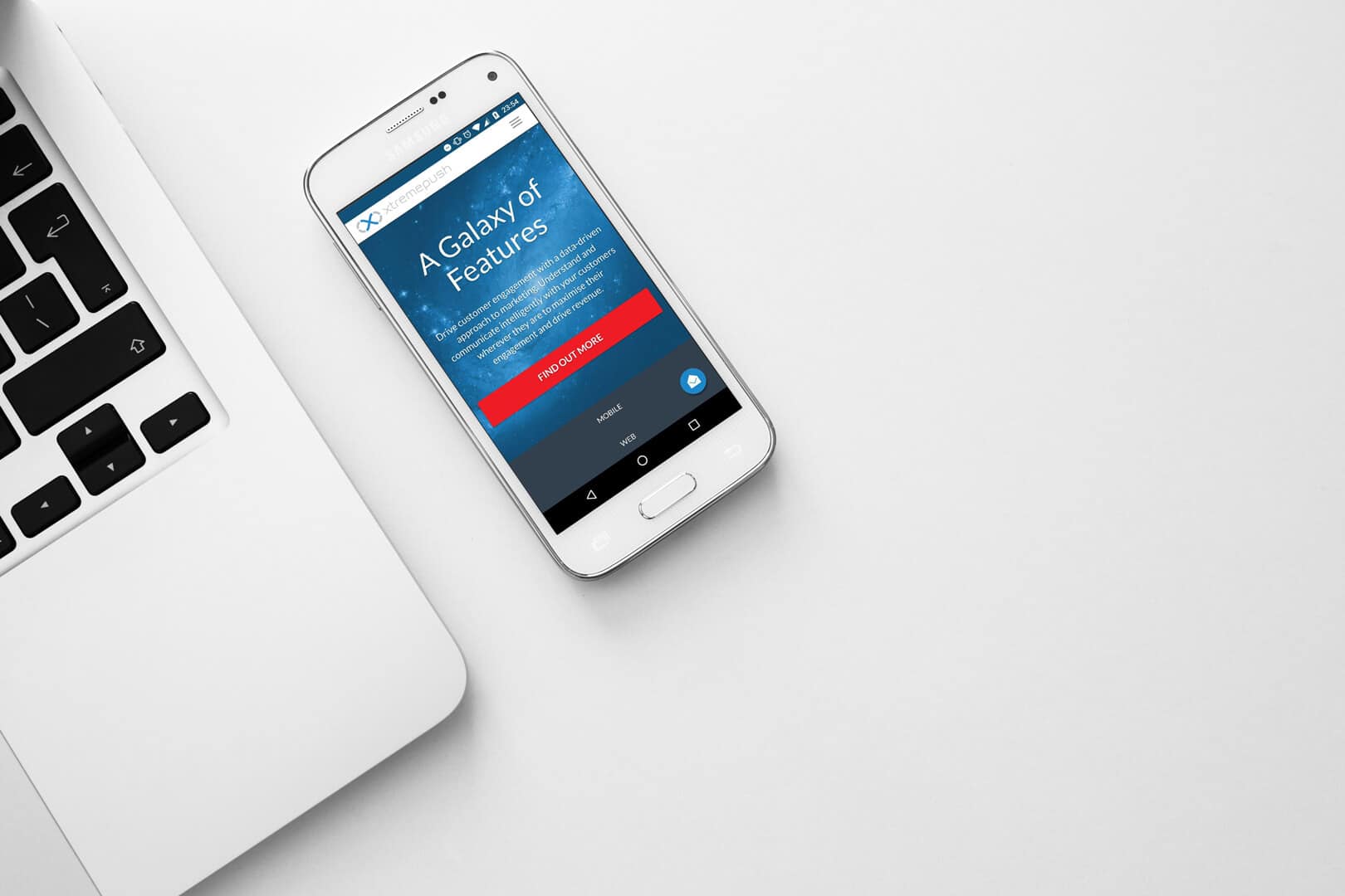
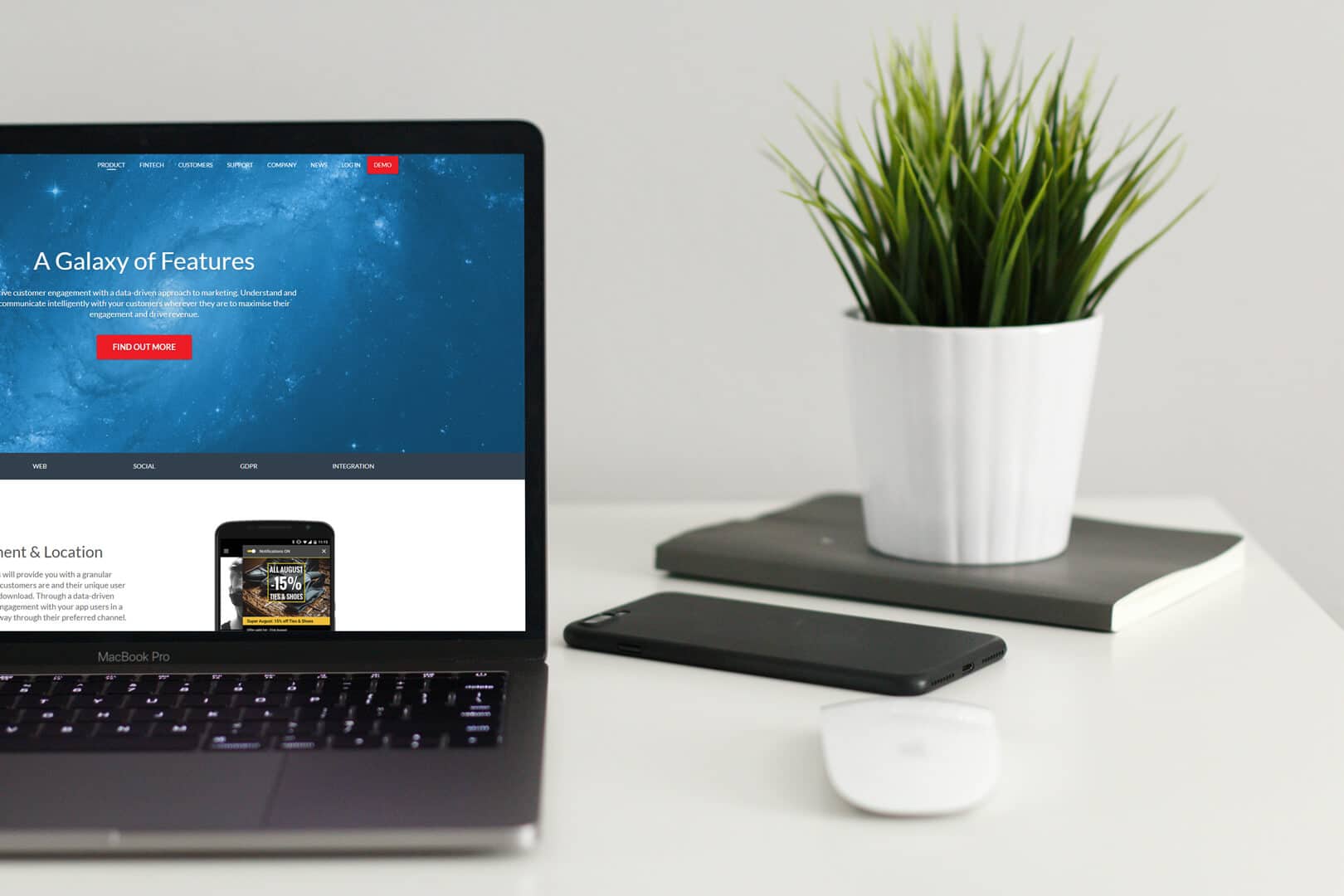
In the years working at Xtremepush, I’ve helped the company to grow from a 5-people-team startup to an international company, selling all over the world, with operatives in all Europe, USA, and the middle east.
A new website
When I joined Xtremepush, the company was facing a big challenge, enter a market of big fishes to compete with them, not eat their scraps.
The goal of Xtremepush had been from start to become a leader in the sector and the new website needed to look modern and professional to stay in the competition.
References and competition
The first thing to do was to analyse the competition and understand the company product.
SaaS products can be incredibly complex and it’s essential for a web designer to understand what the website will promote. It took me longer to start to understand the product and for months I had to learn more and more.
At the same time, I was collecting references from the main competitors’ websites. Listing what I was liking and what not of their websites.
From sketch to code
The design process continued by basing the wireframes (I like to sketch them on paper) on the best reference, the one with most good qualities, and then adding good features found in the other references.
This method made fast making three variants to evaluate, mockup and then quickly proceed to build the real website.
Constantly updating
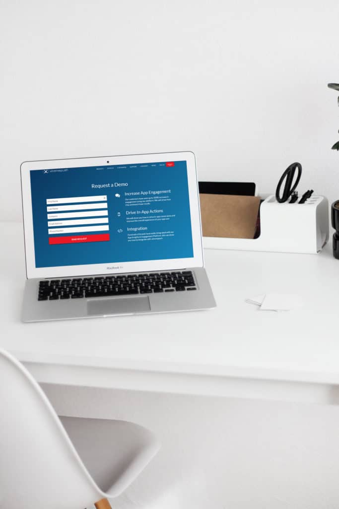
During the years the website has changed a lot, constantly being expanded, refined, and improved on the base of users feedbacks and analytics tools.
Other project I followed for Xtremepush
